renewing a legacy while embracing change
Irao's Rebranding
When a brand has existed for decades, renewal becomes both a necessity and a risk. The central challenge of any rebranding process is finding the right balance: preserving what people already recognize and trust while introducing changes that reflect contemporary standards. The longer a brand's history, the more difficult this balance becomes - but never impossible.
Irao's recent transformation is an excellent example of how heritage and progress can coexist. Here's how the Design Institute developed a new identity for one of Georgia's most established insurance companies.
about the company
For 22 years, Irao has been operating in the Georgian insurance market. Throughout that time, the company has built far more than insurance services—it has built customer trust. As a result, according to Net Promoter Score (NPS), Irao became the market leader in Georgia in 2025 for both health and motor insurance.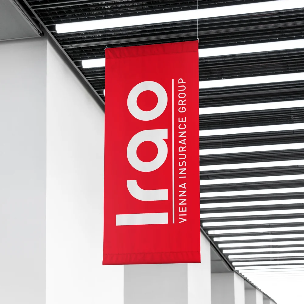
As a member of the Vienna Insurance Group, Irao combines European expertise with local market knowledge, bringing international standards and best practices to the Georgian insurance industry.
Today, the company is entering a new stage of growth, and its rebranding reflects this transformation. The renewed identity is designed to better express the values that have always defined IRAO: trust, expertise, a human-centered approach, and an outstanding customer experience.
Vakhtang Dekanoidze, CEO of Irao:
"For us, rebranding is much more than an aesthetic update—it represents a new stage of development. At one point, we realized that our previous visual identity no longer reflected the culture and energy that had evolved within the company. That realization marked the beginning of this journey."
the challenge
The primary objective of the rebranding was to accurately express IRAO's essence as a trustworthy, high-quality, and people-centered insurance company.
Elene Margishvili, Head of Integrated Marketing Communications at Irao:
"Over the years, the company evolved, and both its visual identity and strategic positioning needed to evolve with it. It was especially important that our leadership team and business stakeholders were fully involved throughout the process. The result is a collaborative outcome that genuinely reflects our ambitions and long-term vision. We were ready for significant change, and together with the Design Institute we successfully navigated the journey - from research and positioning to the development of the new visual identity."
For the Design Institute, the challenge extended far beyond creating a new logo. The task was to preserve IRAO's recognition and heritage while strategically moving the brand into its next phase of development. The new identity needed to communicate reliability, quality, minimalism, warmth, humanity, and confidence - all while complying with the international brand guidelines of Vienna Insurance Group.
Nino Egadze, Creative Lead at the Design Institute:
"Whenever we begin a strategic branding project, our first priority is understanding the people behind the organization and its internal culture. We then carefully analyze the existing brand architecture, preserving every element that already creates value for the business. Starting from scratch is often easier, but our goal is to build tools that support ambitious business strategy.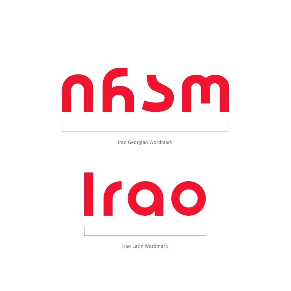
Irao has a remarkably distinctive name, and the visual harmony between its Latin and Georgian versions is exceptionally rare. We also recognized the value of the brand's existing color equity. After analyzing competitors across the insurance category, we chose to retain and refine the existing color palette rather than replace it. Although we worked within strict international guidelines, we were still able to introduce subtle improvements, including refinements to the Georgian representation of the Vienna Insurance Group signature. Ultimately, our role was to translate the company's strong culture, vision, and identity into a strategic and visual system that reinforces its mission."
research
The project began with comprehensive research.
Working alongside research agency Anova, the Design Institute analyzed Irao's social media presence, communication style, customer touchpoints, and overall brand perception. The process also included stakeholder interviews and collaborative workshops where both teams worked together to define the brand strategy, positioning, and long-term direction.
In an era shaped by technology, digital services, and automation, one insight became particularly important: IRAO wanted to ensure that technology would never replace human connection. Customers should feel that, during life's most critical moments, they are not simply interacting with an efficient system - they are receiving support from real people.
Within the new brand platform, Irao adopted the Sage archetype - a brand that earns trust through knowledge, expertise, and experience.
Rather than relying on bold promises, the Sage explains, educates, analyzes, and empowers people to make better decisions. For Irao, this positioning reflects the company's reality, combining the expertise of Vienna Insurance Group with research, data, and a deep understanding of the local market.
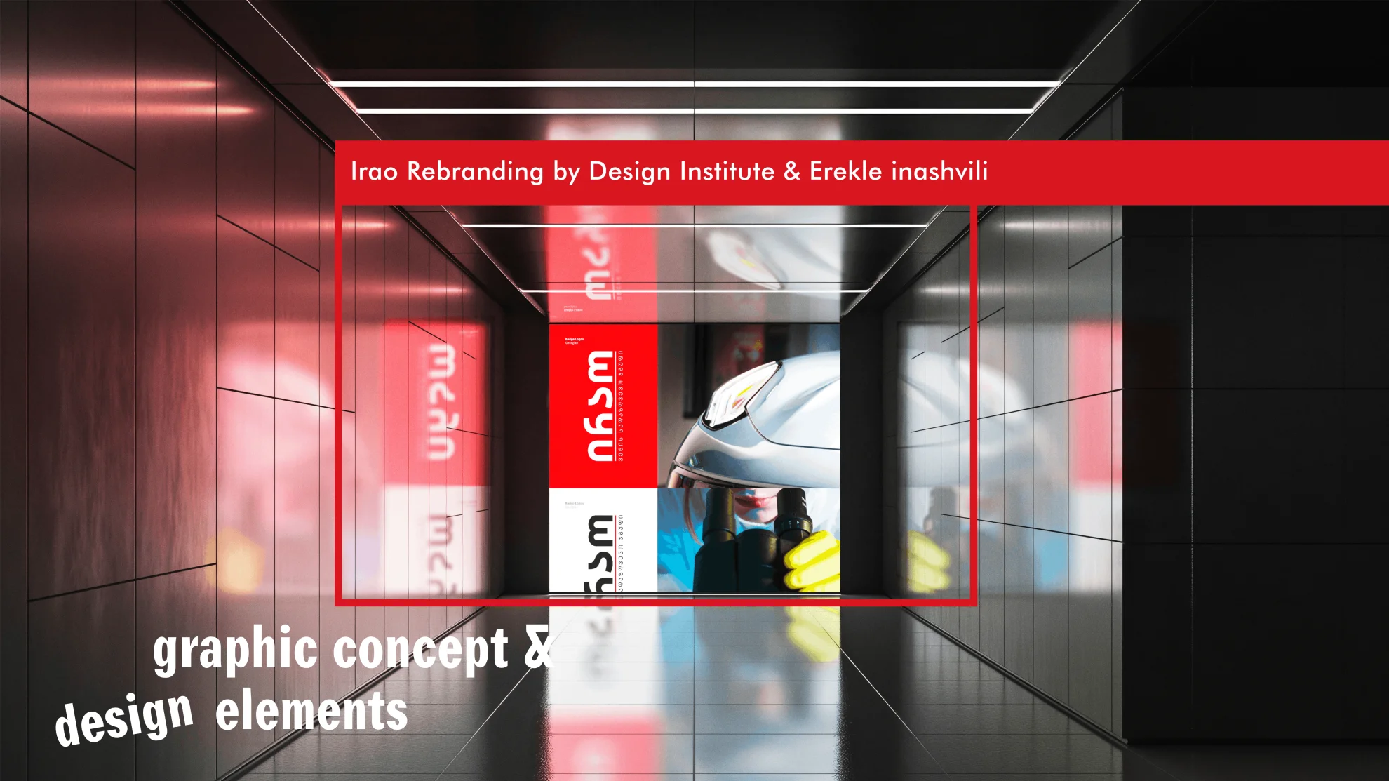
visual identity
The new visual identity was designed by Erekle Inashvili, who developed a custom typeface that creates complete visual consistency between the Georgian and English versions of the logo. For a brand that must simultaneously express local identity and international credibility, this level of typographic harmony carries strategic significance.
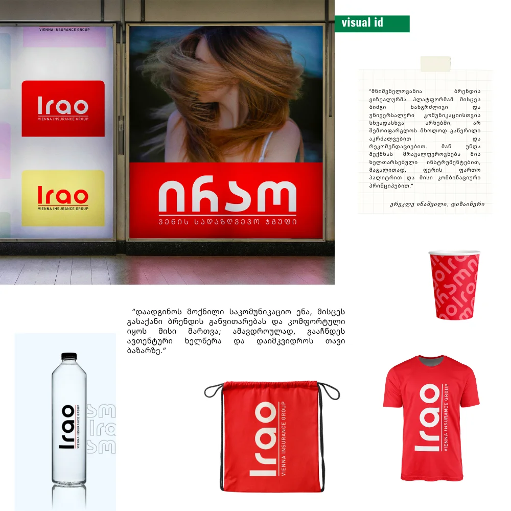
The new logo is confident and minimalist while remaining warm and approachable. It performs equally well across both corporate and consumer audiences, maintaining professionalism without sacrificing accessibility. The visual language reflects the same balance.
Erekle Inashvili, Designer:
"Today's strongest brands are defined by simplicity and confident design decisions. Our goal was to create a visual identity that speaks to people naturally and directly - in a language that feels clear, simple, and friendly. Even insurance brands, once considered highly conservative, now communicate in exactly this way.
A visual identity should inspire long-term, versatile communication rather than simply impose restrictions. It should provide flexible tools for creative expression through color systems, adaptable communication principles, and scalable design assets. At the same time, it must establish a distinctive signature that allows the brand to grow while remaining easy to manage and instantly recognizable in the market."
conclusion
Irao's rebranding demonstrates that modernization does not require abandoning a brand's heritage. Instead, it shows how thoughtful strategic design can preserve familiarity while preparing a brand for the future.
More importantly, the project reminds us that design is never simply a visual exercise. It is an extension of business strategy, organizational culture, and customer experience. In Irao's case, the new identity achieves precisely that balance: the brand remains recognizable, yet it now communicates with greater clarity, stronger relevance, and a visual system that reflects where the company stands today—and where it is headed next.